Problem
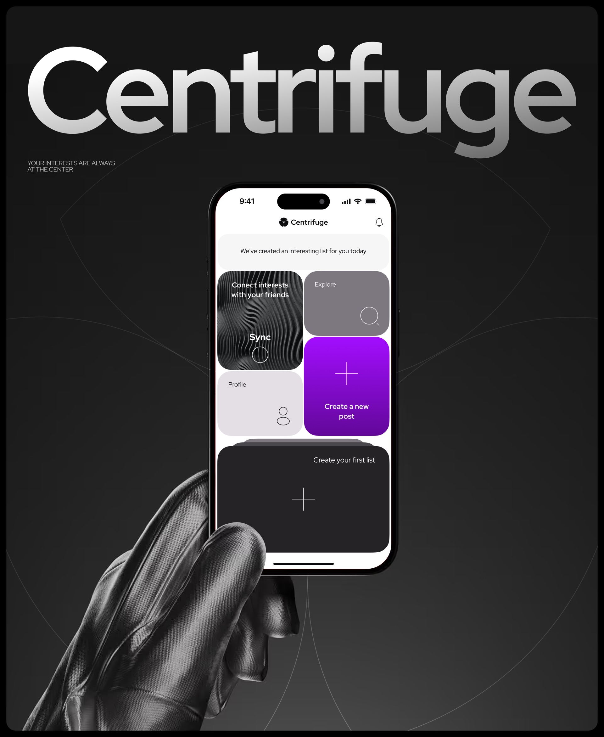
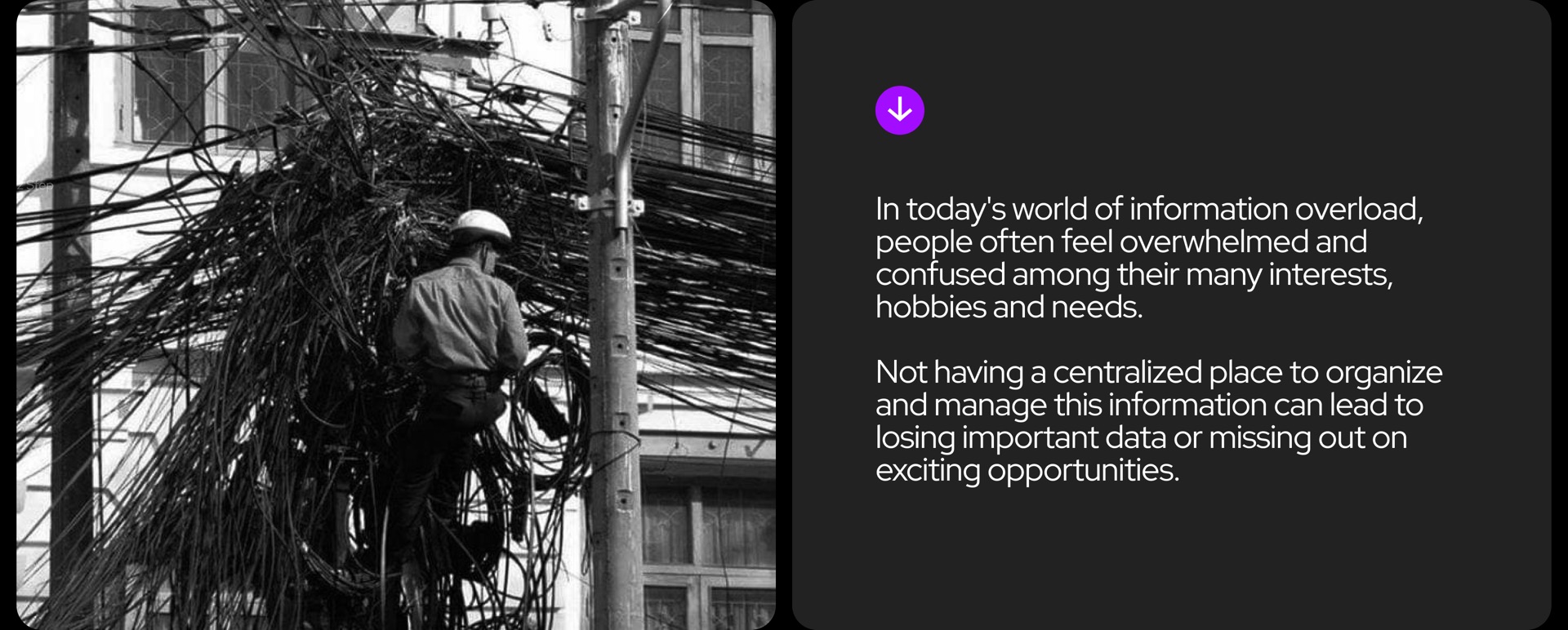
Every app solves one task: inspiration, messaging, finding places. There is no single home for your own interests. Saved content gets lost and is hard to find again.
Research
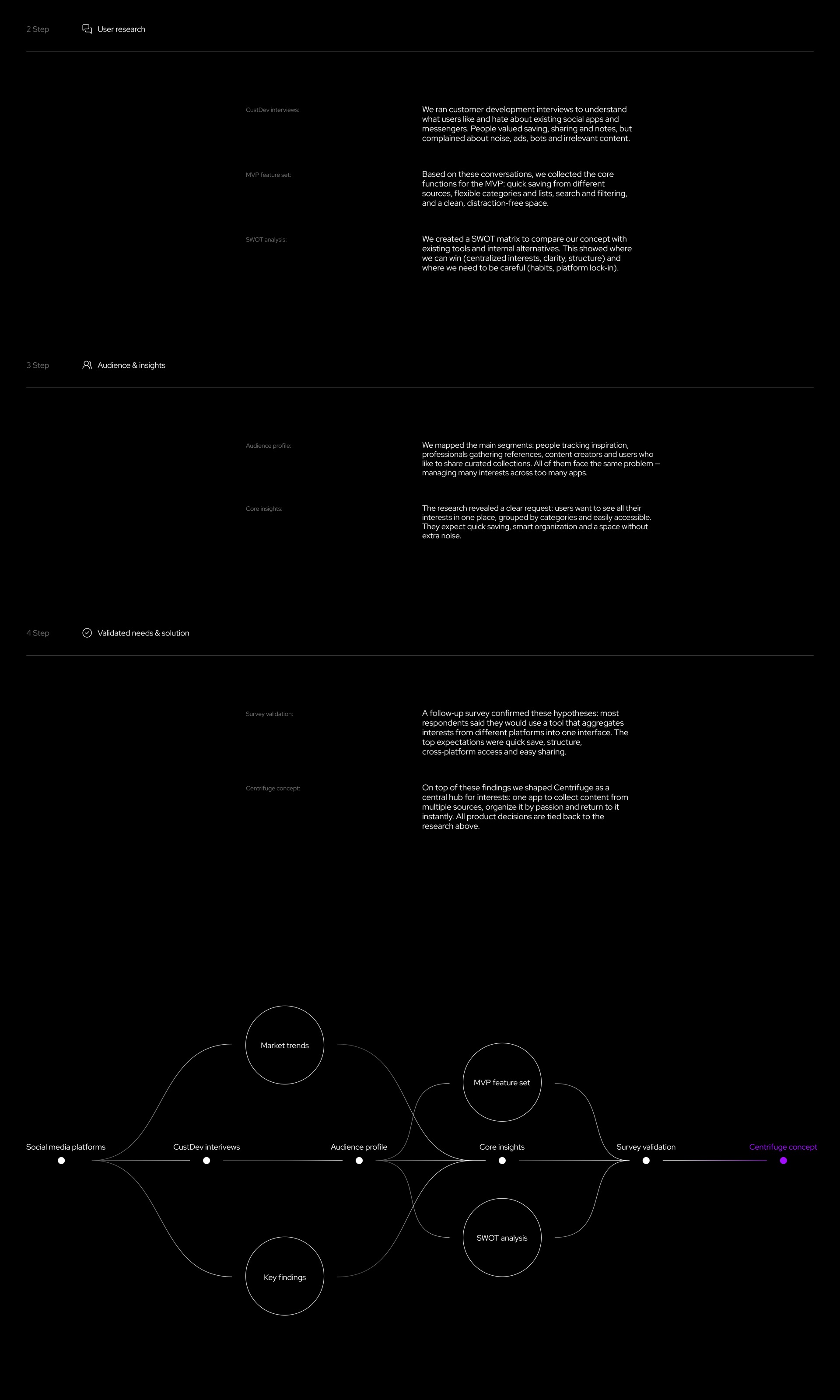
The team went from market analysis to validation:
- Platform analysis: Facebook, Instagram, Pinterest, Twitter, TikTok. Each one does its job well, but none lets you manage your interests in one place.
- Customer interviews. People value saving, sharing and notes. They dislike noise, ads, bots and irrelevant content.
- MVP feature set: quick saving from different sources, flexible lists, search and filters, a space without distractions.
- SWOT: where we can win (structure, clarity) and where the risks are (habits, platform
lock-in ). - A survey confirmed that most respondents would use such an app. Top expectations: quick saving, structure,
cross-platform access and easy sharing.
The job to be done: "Help me quickly structure my interests and find relevant things without losing ideas or wasting time in information chaos."
My role
- Helped the art director with research and feature ideas.
- Proposed search that works differently with and without location access.
- Took part in the concept and designed some of the screens.
- Took single screens and developed them into every state: empty, error, loading, edge cases.
- Set up styles, updated the design system and built it on tokens for light and dark themes.
Key decisions
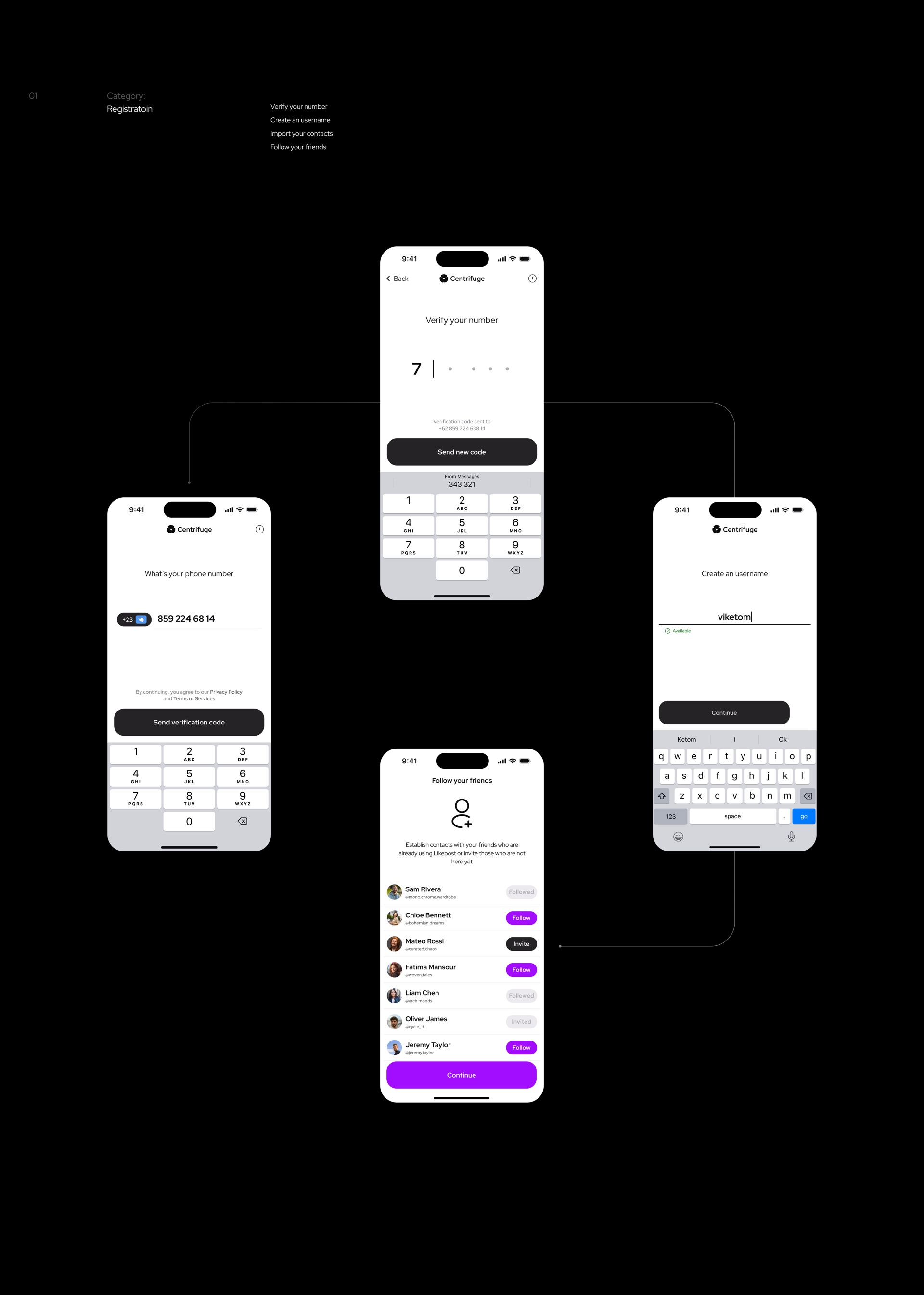
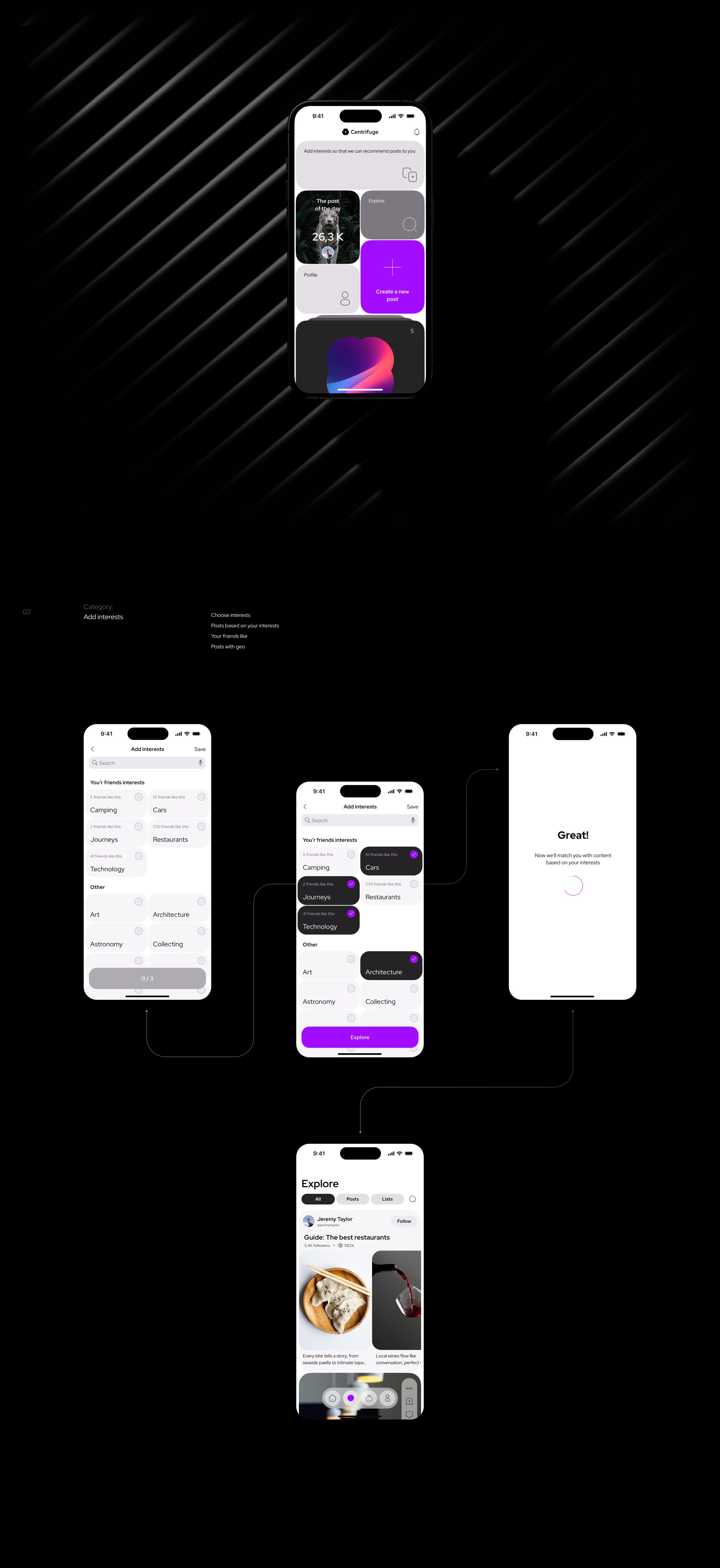
1. Onboarding through interests
Right after
2. Search with and without location
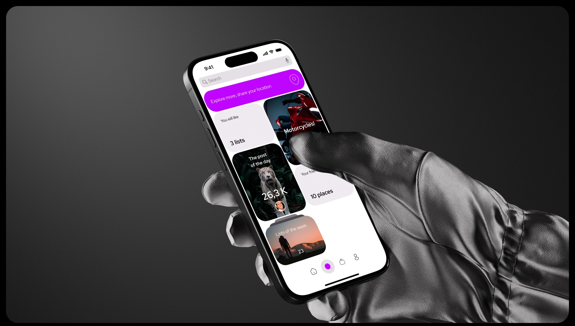
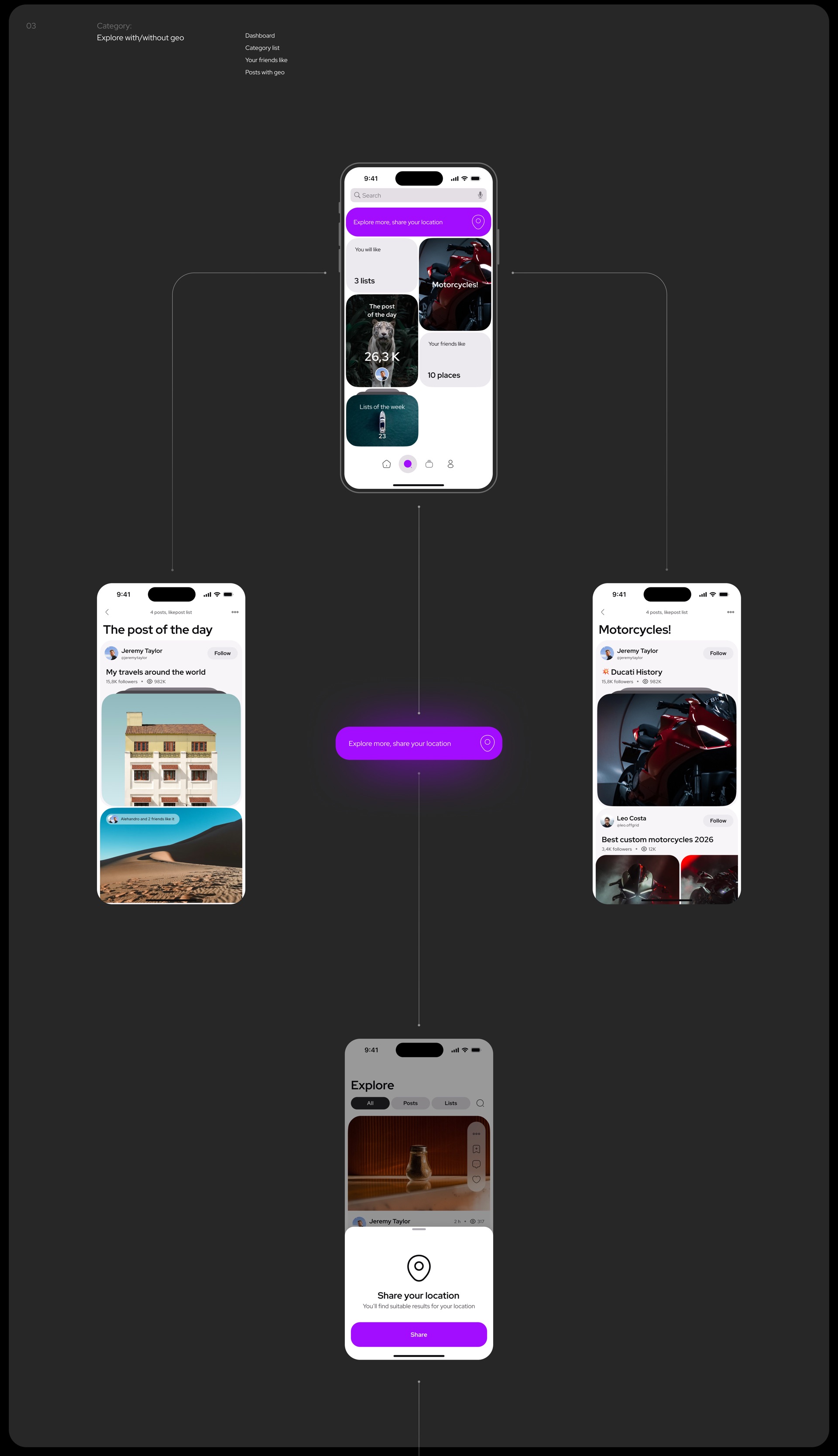
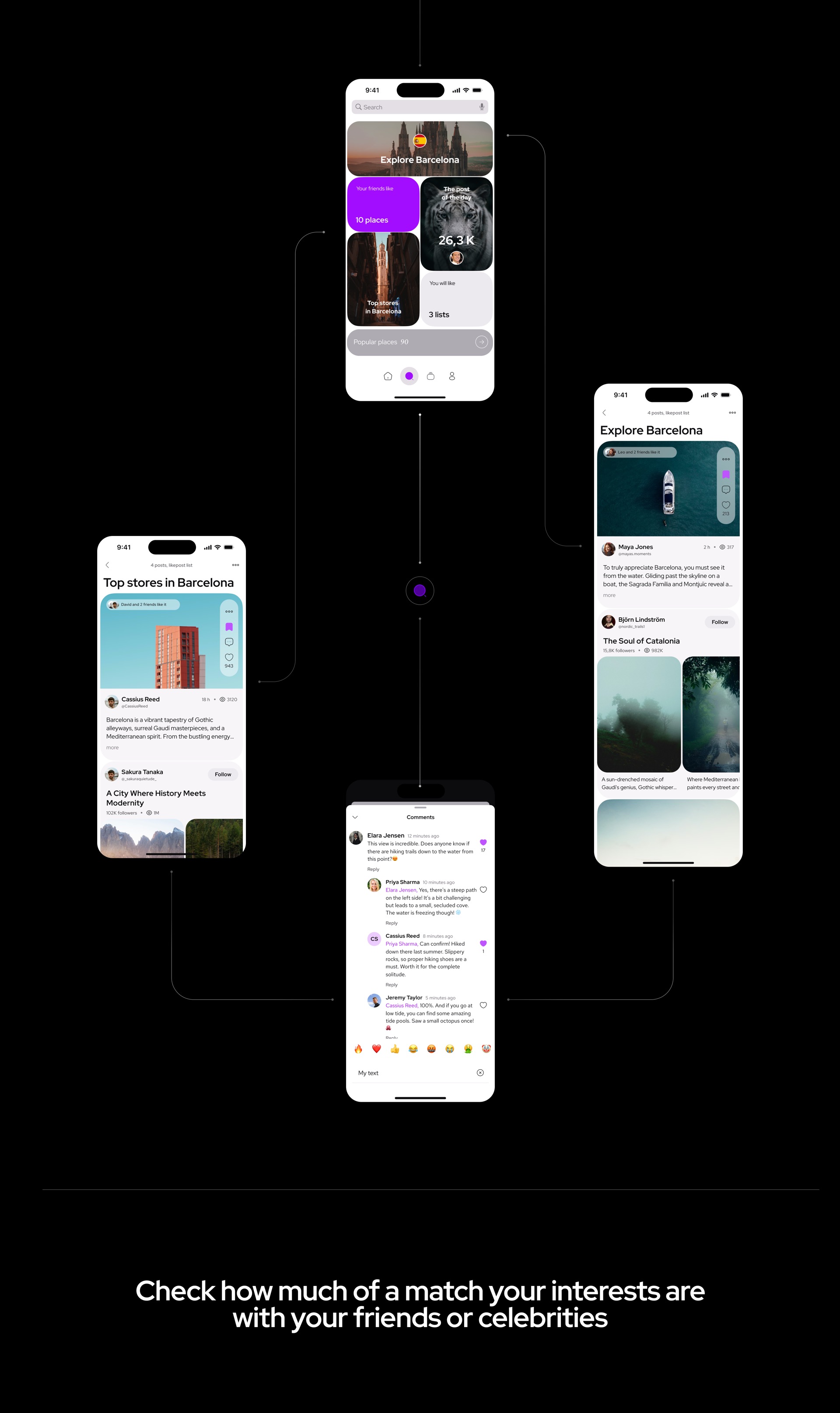
With location on, you see your city and places around you: what your friends like and top spots nearby. With location off, search works through interests and collections, and the app gently suggests sharing location. Nobody hits an empty screen.
3. Likematch
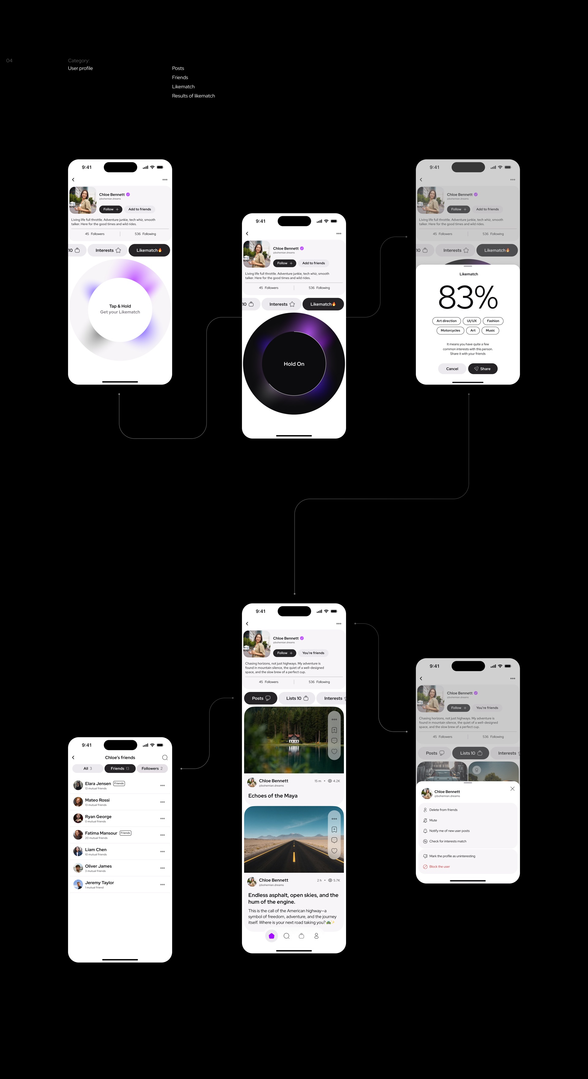
On someone's profile you press and hold, an animation "spins the centrifuge", and you get a match percentage with your shared topics. You can share the result. Your own profile shows which friends you match best.
4. An AI writing assistant for posts
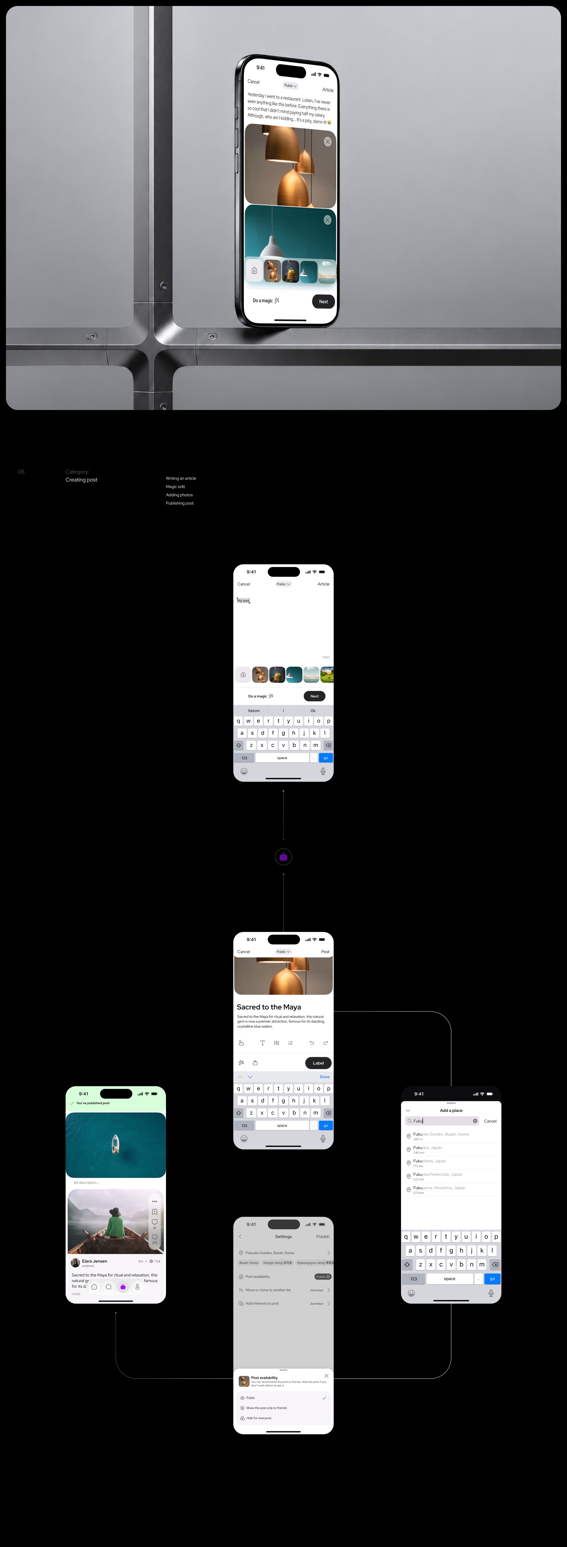
When creating a post, Magic edit improves the text. We designed it in 2023, before such assistants became standard in social apps.
5. Privacy for lists and posts
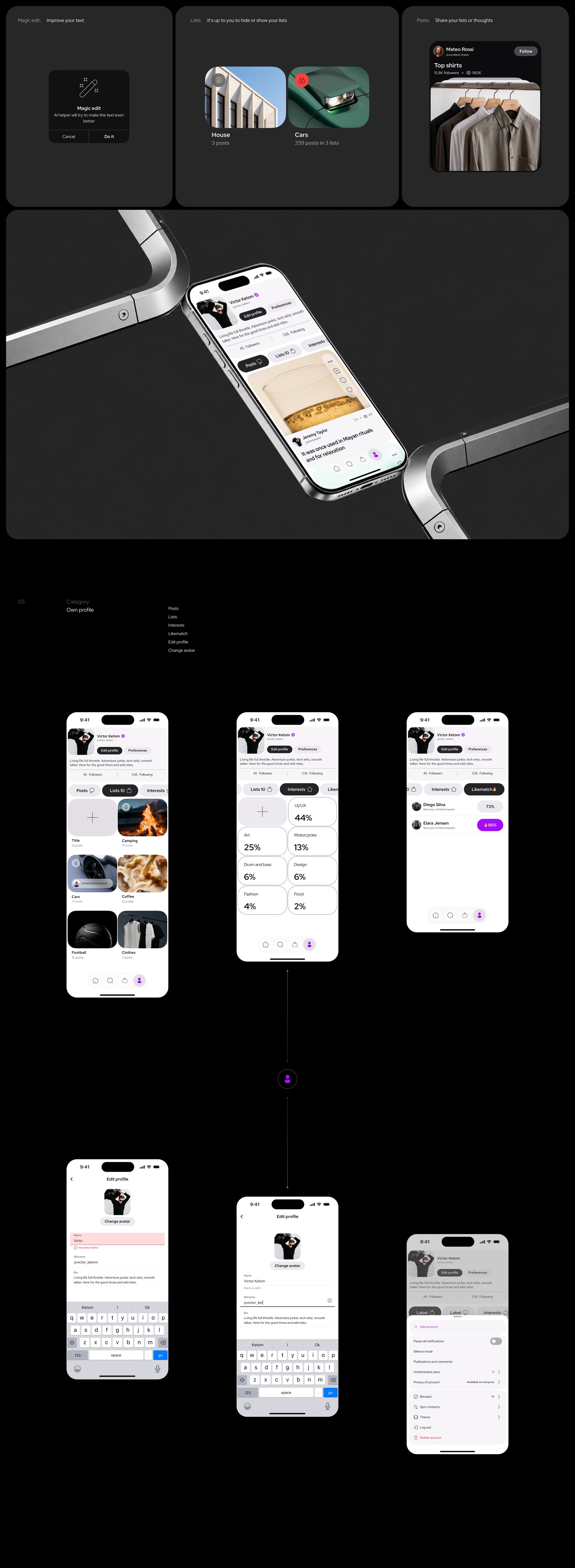
Lists can be hidden or shown, and every post has three visibility levels: everyone, friends, only me.
6. One system, two themes
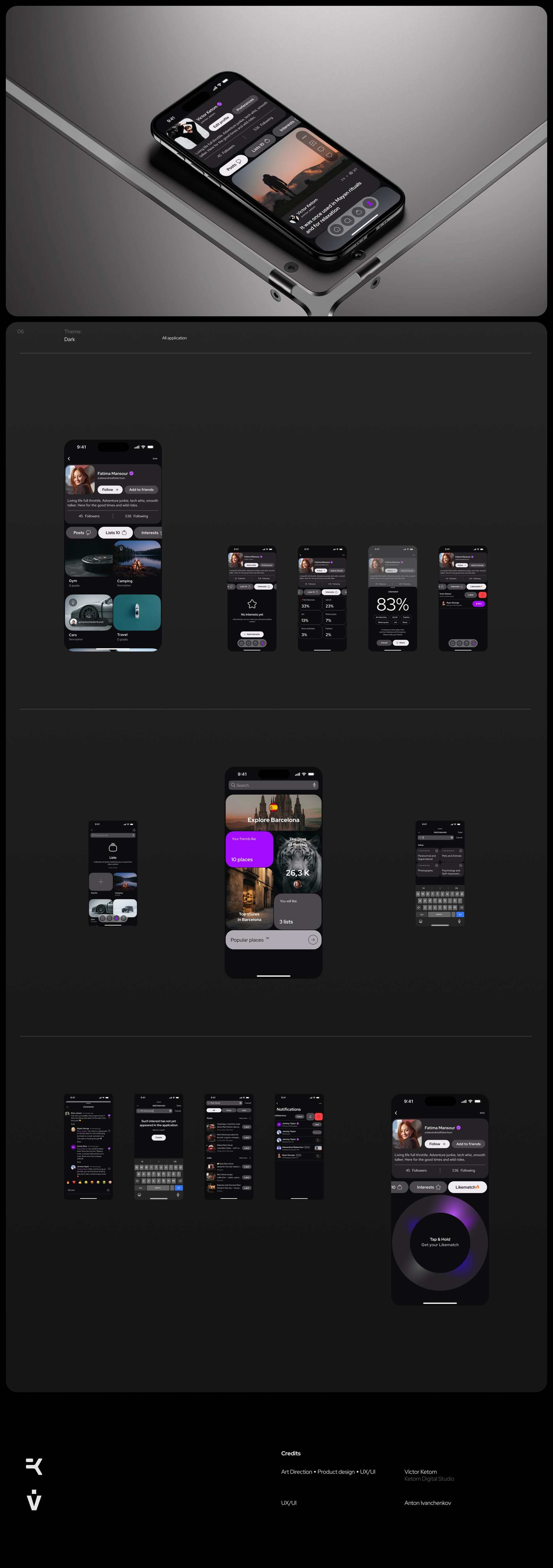
Every section is built on tokens, so the whole app works in light and dark themes.
Outcome
The app was released on the App Store. After launch the product went through major changes: the design was reworked several times, and today the app is available under a different name and identity.
Over the project: research, 6 core flows, a full set of states and a design system for two themes.