The brief
A website for the 100th anniversary of Genrich Altshuller, the creator of TRIZ, the theory of inventive problem solving. Two kinds of content: 26 biography episodes (
The brief named the problem of the existing site: the biography and the programme live in two separate feeds, and visitors do not understand what an event has to do with Altshuller.
Behavior first, brief second
Before reading the brief, I went through sites of a similar kind: an events listing, a cinema, the Steve Jobs Archive. I did not note what looked good. I noted my route: where I clicked, what I looked for, where I got lost. That gave three visitor questions: "when?", "about what?" and "who is he?". Each one needs its own entry point.
I reviewed the old anniversary site the same way. The word I wrote down was "a mess": three parallel feeds with no visible link between them.
The first contradiction
Before defining the problem, I went back to the materials, because I did not understand the nature of the link. The answer: the link is about meaning, not dates. A 1974 episode and a 2026 webinar share a topic, not a date.
- If the site is organized by time, visitors assume an event's date relates to the episode's date. It does not.
- If it is organized by meaning, the link reads correctly, but chronology breaks and someone looking for the next event gets lost.
My first idea was "three modes for three user types". I rejected it: it shifts the work onto the visitor. The building block of the site became the link itself, the pair "episode ↔ event".
The real problem: 10 out of 26
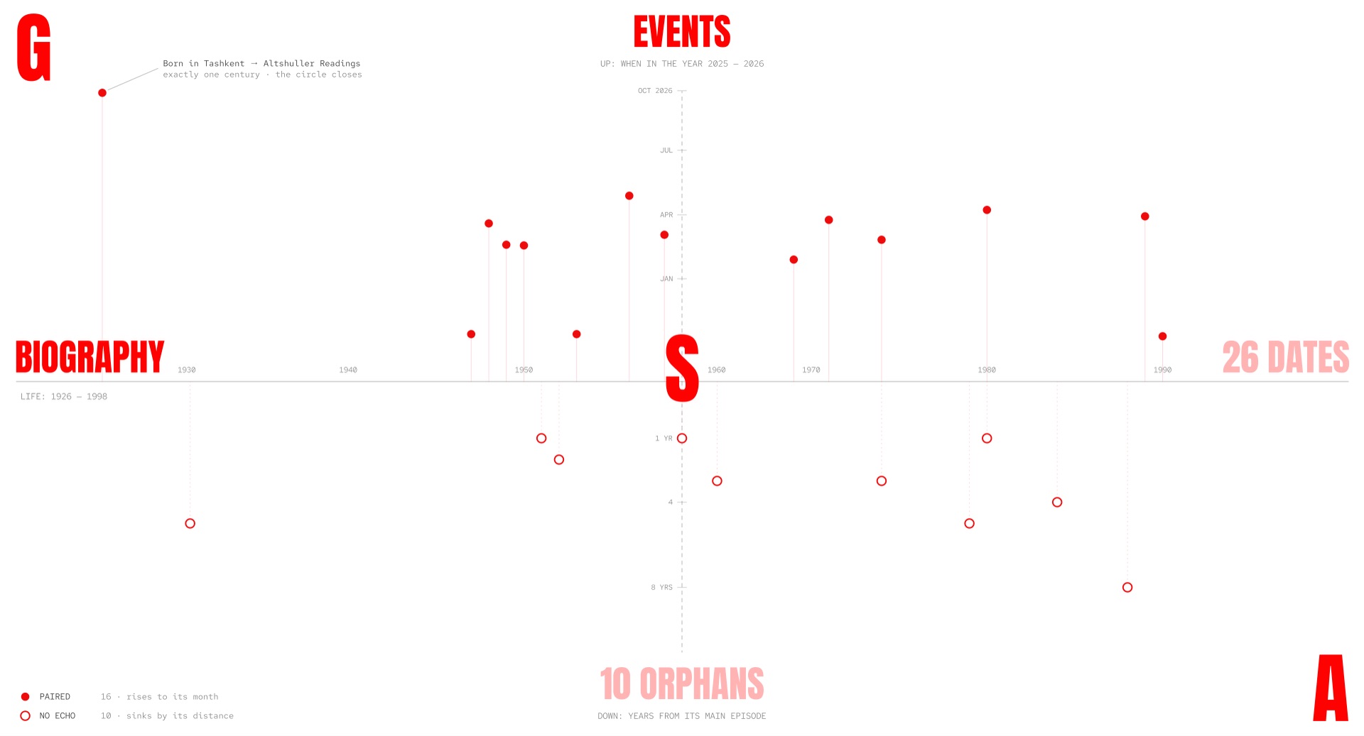
In a group session we found what lay deeper: 10 of the 26 episodes have no matching event. At these points the link simply breaks.
- If you can jump from the biography to the programme everywhere, behavior is consistent, but from 10 episodes there is nowhere to land.
- If you can jump only from linked episodes, you always land precisely, but at 10 points the interface behaves differently.
The solution I dropped
My first solution was to remove the unmatched episodes: no pair, no "why is this empty". It looked tidy, but it worked around the problem instead of solving it. 40% of the biography disappeared, and the original complaint stayed unanswered.
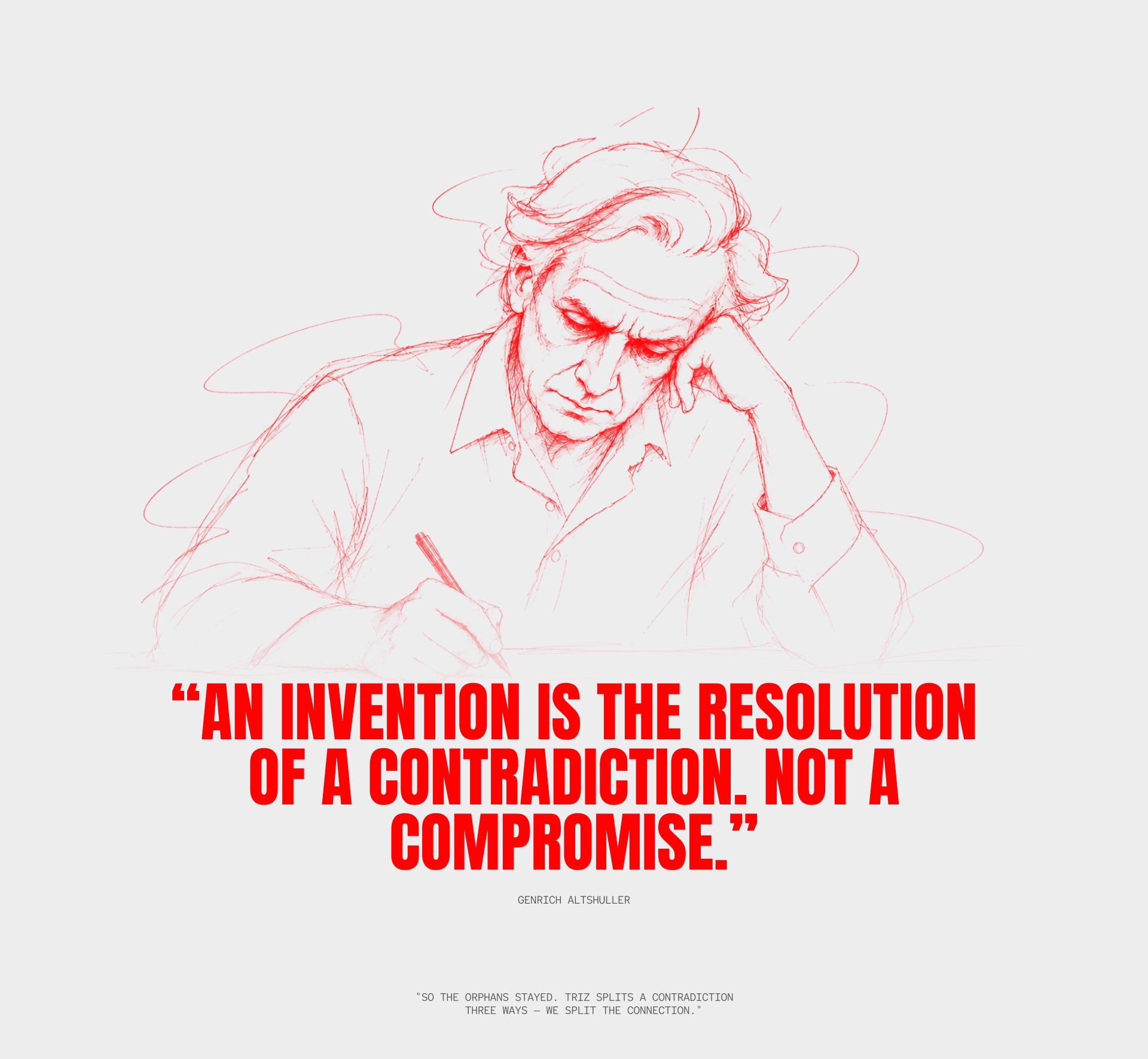
Altshuller put it this way: "Invention is resolving a contradiction. Not a compromise."
Three separations
TRIZ separates a contradiction in time, in space and in relations. I separated the link itself:
- Time. The link stays silent until you reach it. It turns on when an episode arrives at the line.
- Space. The biography is the axis, and events sit right next to it. Linked items are never far apart.
- Relations. The link is asymmetric: the biography leads, the programme responds. Every event has an episode, but not every episode has an event, so gaps exist only on one side.
Along the way I caught my own mistake: from day one I kept "two columns" in my head and ran every idea through them. The form had frozen before the analysis was done. I had to let it go and let the form grow out of the separations.
How it became an interface
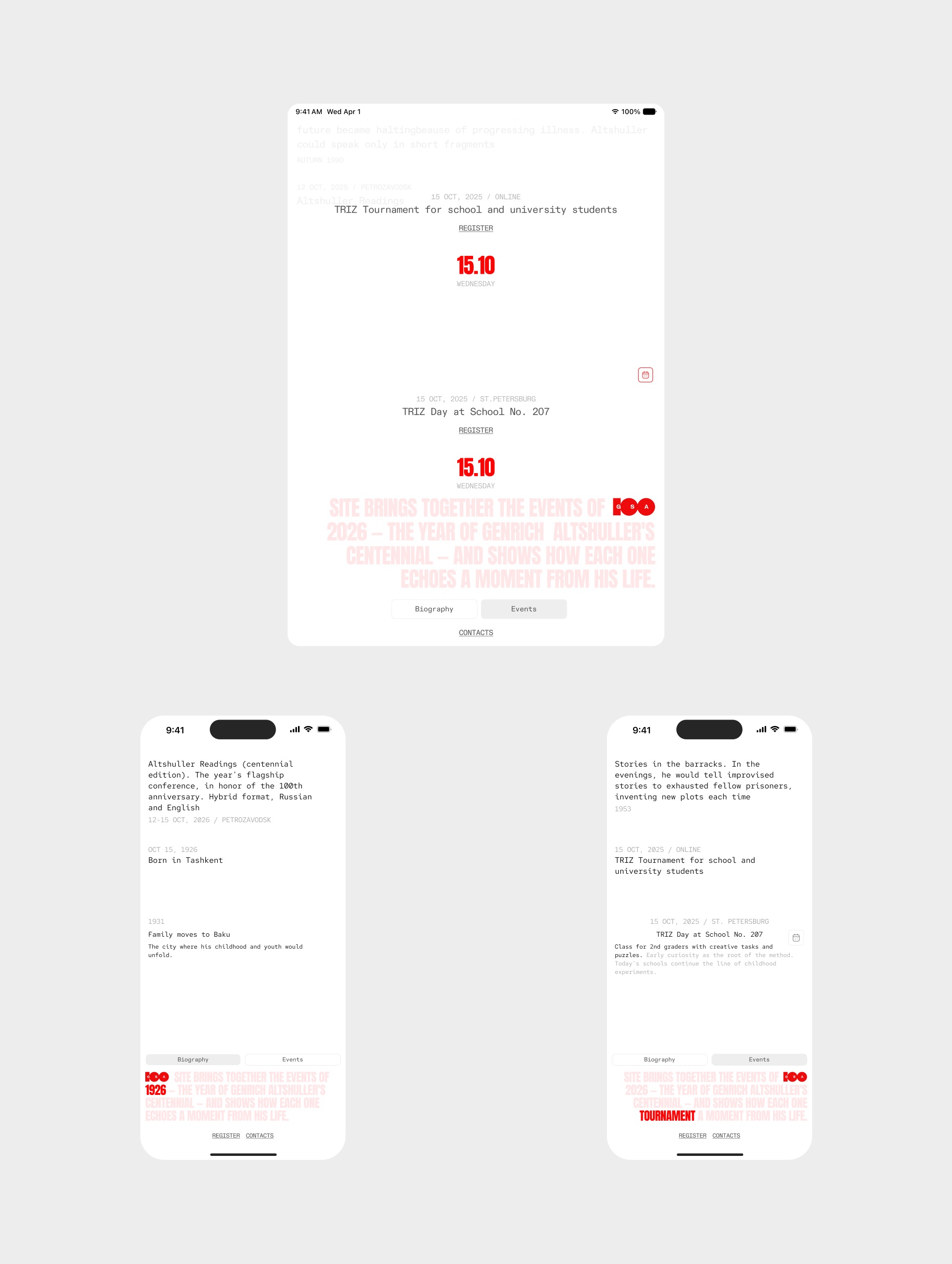
- A control line. A horizontal line across the middle of the screen. When an episode reaches it, its event appears next to it. The link reads through proximity, no arrows or lines.
- Unmatched episodes stay, with their own behavior. They move in a second, smaller column to the right. When one of their titles overlaps a main episode, it slides aside. A main episode pauses on the line while its unmatched neighbors pass, and only if it has any.
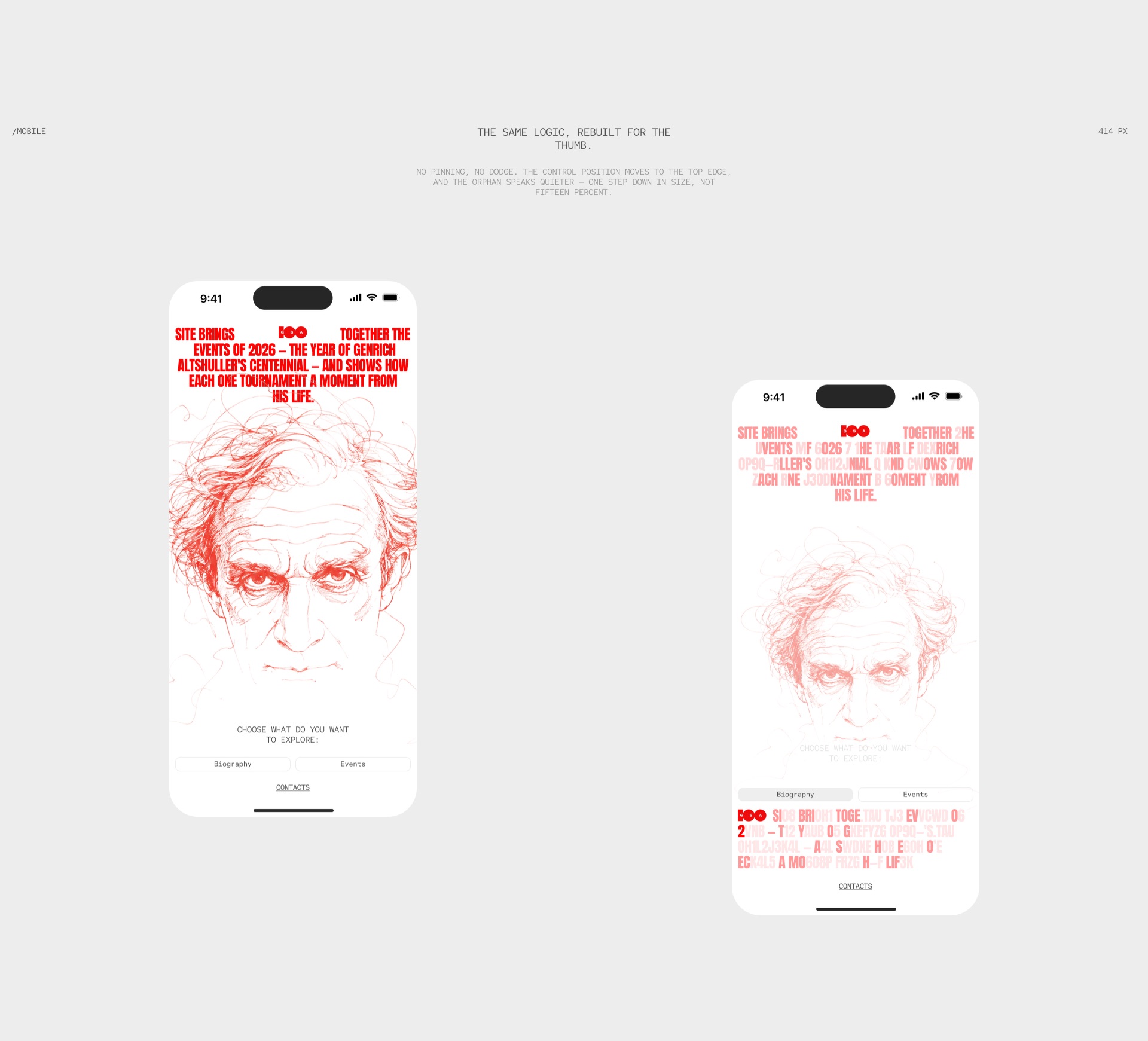
- The logo shows the mode. With no choice made, it sits in the center. Choose the biography and it moves left; choose events and it moves right. Navigation without separate navigation.
- The headline follows what you read. It says "2026". Reach an episode from 1950 and the digits cycle to "1950", then back.
- The calendar turns links off. When you need a date, descriptions disappear, events group together and the biography stops responding. People scroll fast there, and flashing links would only confuse them. The link is an object with a switch, which shows it was designed, not drawn.
- Monospace type and cycling letters. TRIZ was created by engineers for engineers. Text that rebuilds letter by letter refers to the drafting rooms where the method was born.
Build
I built the site from scratch with
What I learned
You do not show a client the deep problem; you show them the difference. A solution that works around the problem leaves the site as two feeds in separate rooms. A solution that removes it makes all 26 episodes serve one idea.